Orange Money Europe
A meaningful major design refresh for a money transfer mobile app
Context

Orange Money Europe, formerly Orange Money France, was made available in France in June 2016. Users can use the Orange Money Europe mobile app to transfer money and mobile credit to their family and friends. Initially, the focus was on African destination countries catering to the African diaspora. Since then, Orange Money Europe has progressively expanded its services to other continents as well.
Challenges
To create a unified design across the Android and iOS mobile apps for a more consistent experience
To position the product to be more fintech-competitive considering the wider range of product features planned
To create something more aesthetically pleasing for increased user engagement and emotional connection
To work with a design system that is capable of handling the increasing scale of design of the product
To address the current user pain-points, needs and interests gathered from the usability test reports, user research team and analytics
To address the key user pain-points: more visual aid required for a few sign-up steps as the analytics revealed some users are not following some instructions properly
Discovery
My role
Reviewed the latest usability test reports related to the previous design to deduce user pain points and explore ideas for improvement
Informally interviewed colleagues as potential users to gather insights on the positives and negatives of their most favourite money transfer/finance apps
Collaborated with a dedicated user and market research team to broaden our understanding of the behaviour, perception, and thought processes of the user types we design for
Benchmarked several direct and indirect competitor apps for design inspiration

Usability tests shared by the Market research team

Some user feedback I gathered from colleagues regarding competitor apps
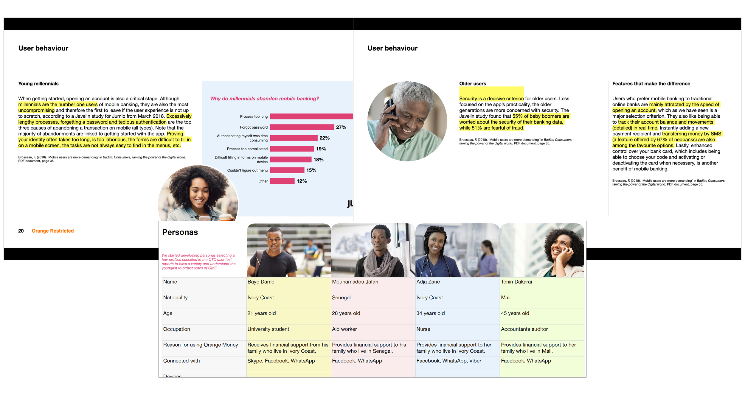
Carried out secondary research to supplement our persona analysis
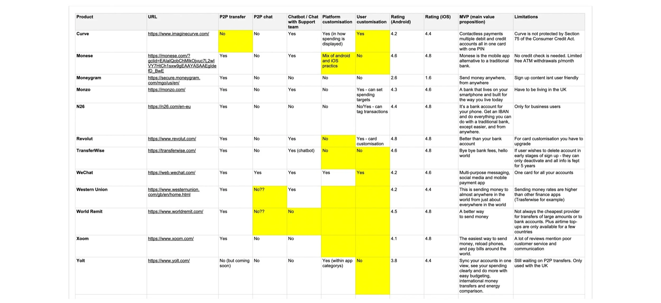
Competitor analysis
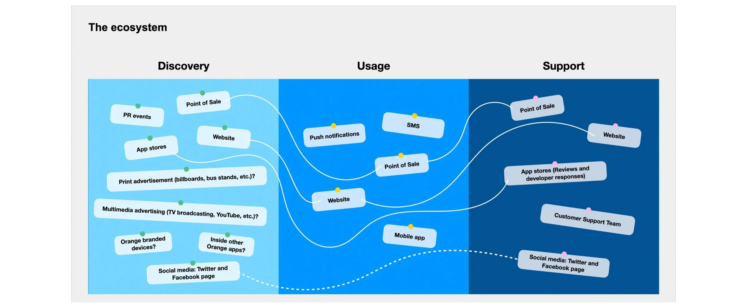
Understanding all the Orange Money Europe touchpoints

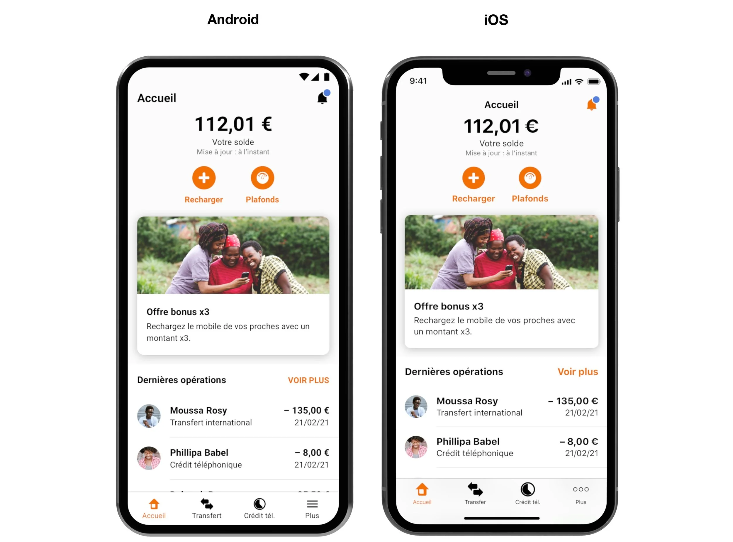
The Before version of the app (Home screen): inconsistent user experience across the two mobile platforms (the user insights revealed that most users use multiple smartphones and that can be a mix of mobile OS. Some users expressed that it’s annoying that there are experience differences between the two mobile platforms. For example, the Money transfer feature is presented as a card on the Android Home screen, whereas in the iOS version, it sits in the navigation bar at the bottom.
The Before version of the Money transfer UX with a linear sequence of steps was no longer going to work if new steps will be added due to the increase in complexity. A modular UX approach had to be defined.
Transform
My role
Prepared for and partly facilitated a design workshop to review our findings with the stakeholders, and to ideate with them design solutions for newness or improvements
Explored potential design directions for a design refresh based on the discussions with the stakeholders and conclusions from the design workshop
Conducted guerrilla user testing to analyse further some of the more integral features and see how users find our new solutions to be working
Redesigned the navigational structure and information architecture
Focused on screen redesigns that would bring cohesion, harmony and greater visual appeal
Reworked the money transfer UX to create a design model that is modular in creation, adaptive to the varying journeys, and scaleable to cope with the growing list of destinations and the feature complexity
Design workshop with the stakeholders
Design workshop with the stakeholders
Design workshop with the stakeholders
Researched case studies used to inspire potential design directions
Exploring potential design directions with the stakeholders
Inspirational moodboard
Inspiration for navigational structure
Navigation and information architecture
Reworking the UX for key features and journeys such as money transfer and sign up
Planning the key items required to construct a local design system
Conducted guerrila user testing (on colleagues) to test out initial ideas for the improved sign-up journey
Test survey for a new money transfer UX approach
Make
My role
Created a mini library of all our UI components and common UX patterns to build a design system tailored to mobile money and finance products. The purpose of this was to help us maintain consistency in the visuals and experience and efficiency in our design as the product scope increases.
Redesigned the entire UI for the Android and iOS mobile apps
Completed the design handoff for the Android and iOS mobile app screens
Created a click-through prototype containing all the key finalised screens
Reviewed and tested the implementation shared by the developers and reported design feedback to them
The redesign
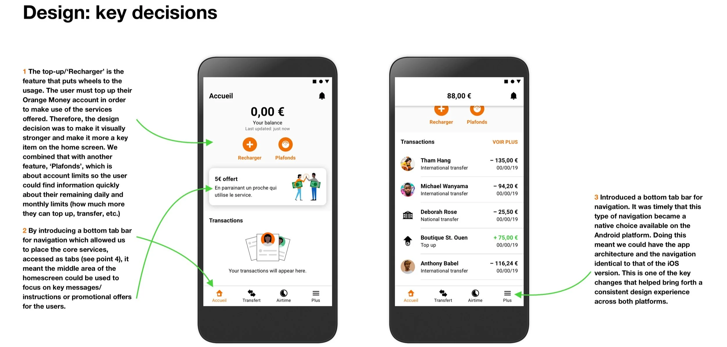
Key design decisions

Local design system creation
App demo: new Money tranfer UX
Previous design
Additional roles
Presented the design progress to the stakeholders weekly
Pitched design ideas to the stakeholders
Managed the planning of our design activities
Reported our design planning to the stakeholders weekly
Redesigned the responsive website for Orange Money Europe
Designed the app store screenshots for the Google Play Store and App Store
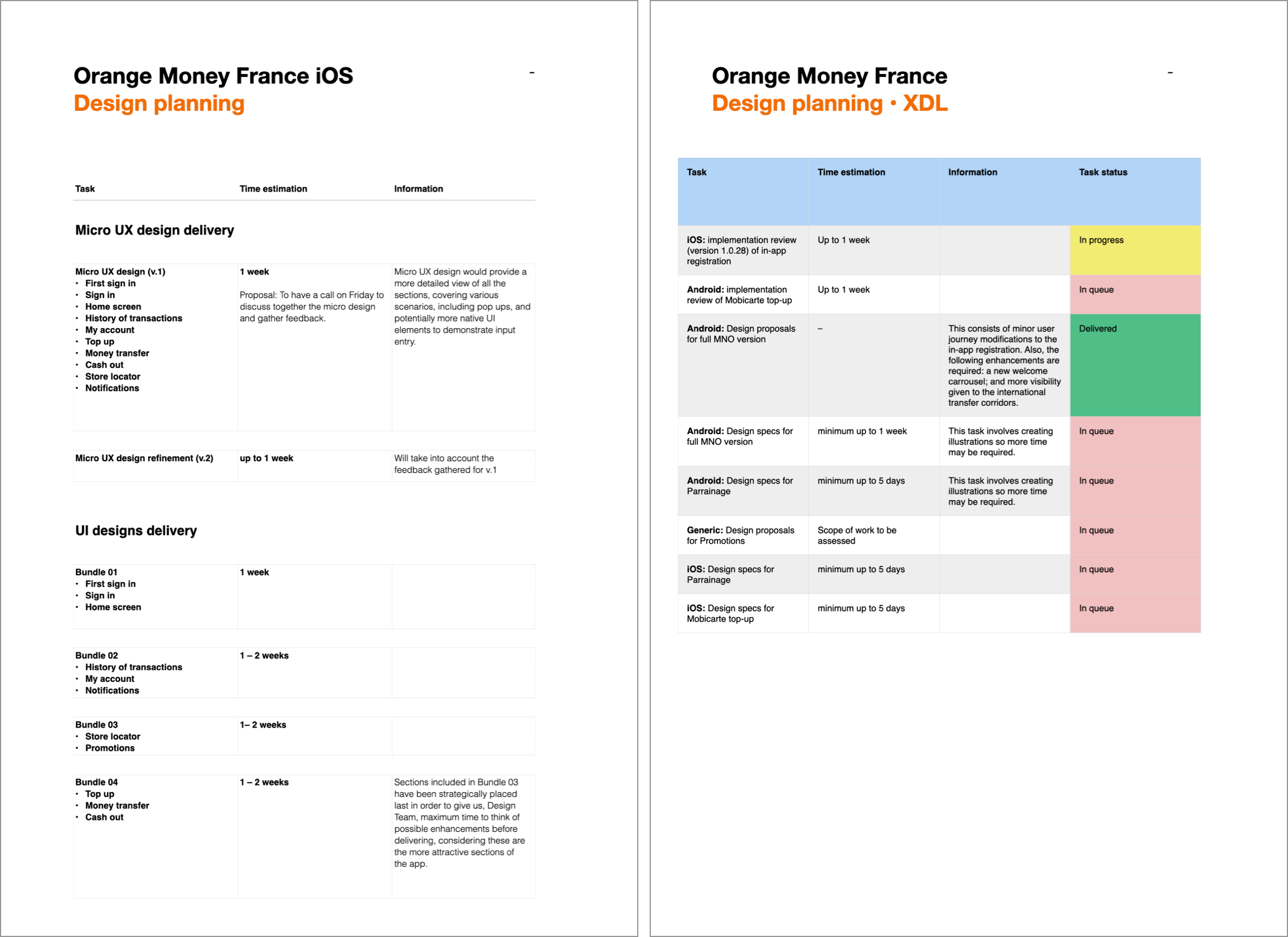
Design planning

Website sitemap analysis for the redesign

The redesign

The redesign


The redesign: transformed plain tables of data
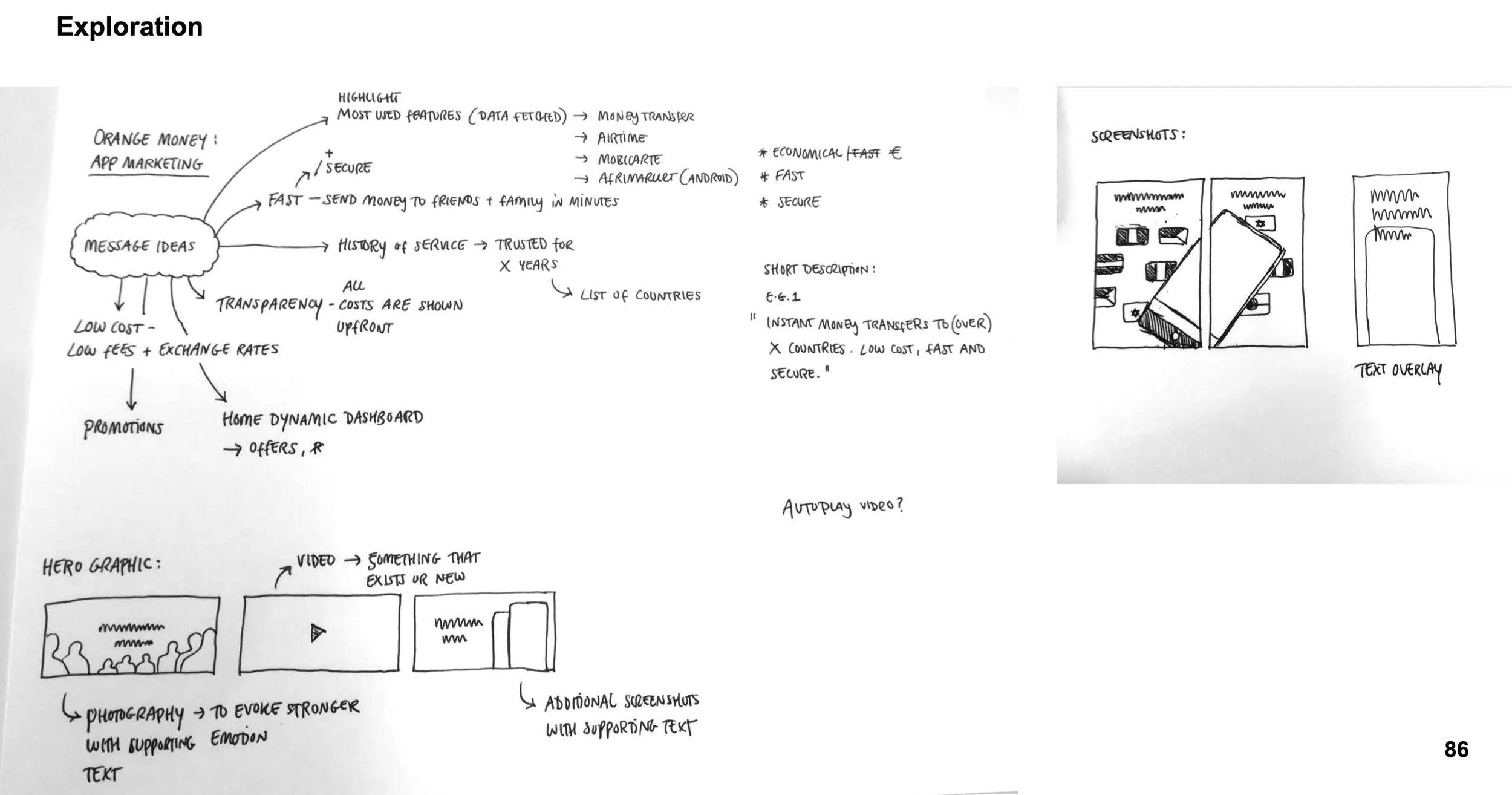
Brainstorming visual communication ideas for the app store screenshots gallery

The published screenshots on the app stores

The complete screenshots gallery
Impact / achievements
An overall positive reaction towards the design refresh from test participants shared by the User Research team
Orange Money Europe achieved its target number of active customers this year (2024) much earlier than forecasted. A press release is coming soon.
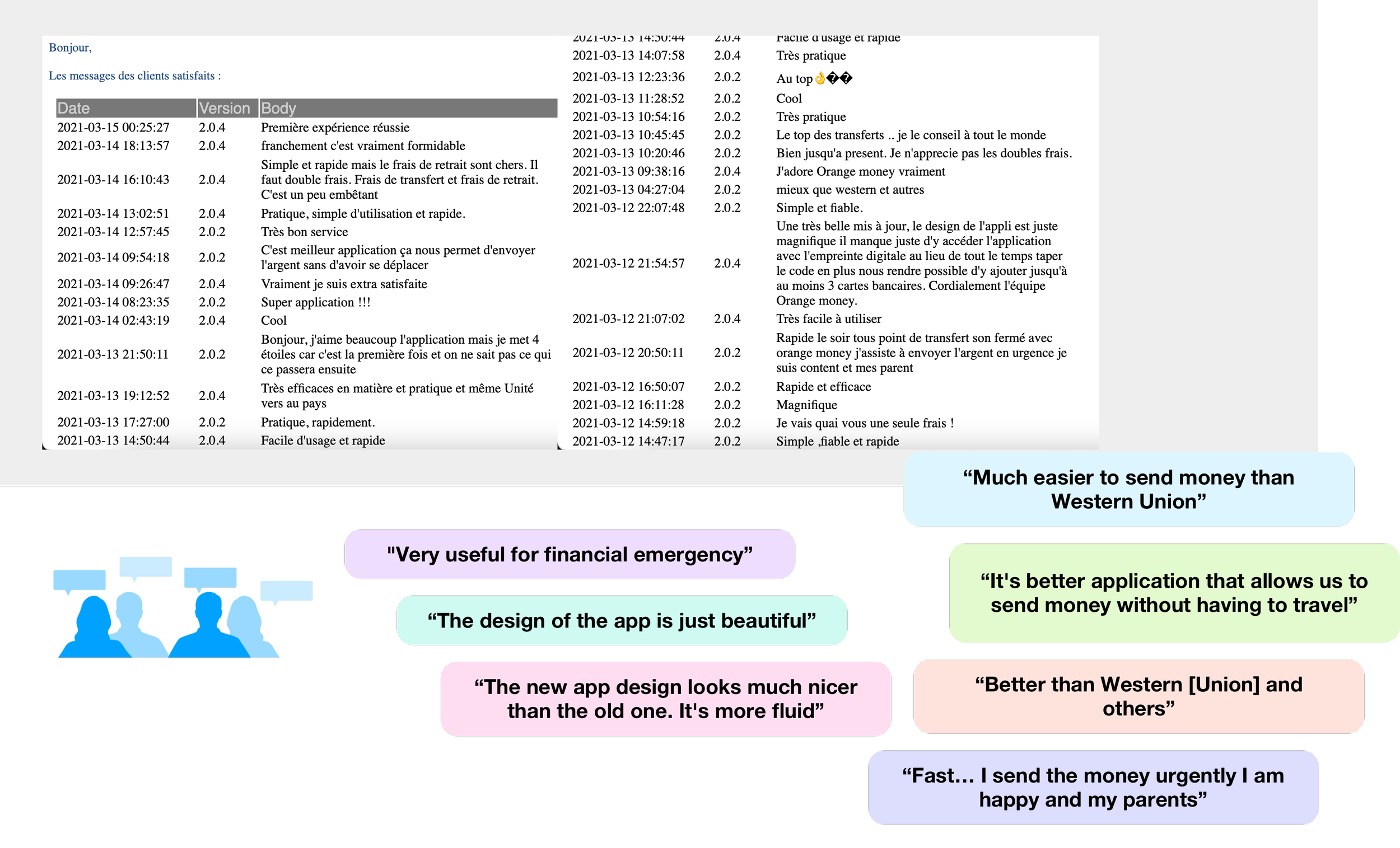
Data shared by the User Research team